Anatomy of color in web design: Brown
A week ago you could have seen the post about the yellow color in the web dizyne , this time we decided to show the sites using brown.
Honestly, almost every Web site dedicated to coffee and a site in the retro style is made with the use of this color, but There are many interesting sites that pretty brown-to-face :)
Carnivale du Vin

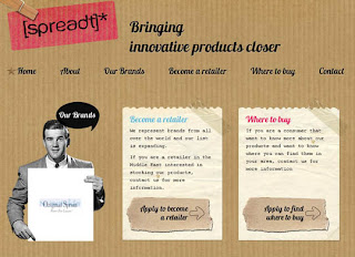
Spreadt
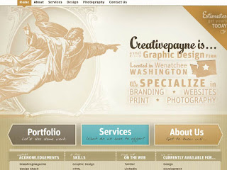
Creative Payne
Epicales

Ready Made Designs

The Peach Design

Jan Ploch

Molecube

Head2Heart

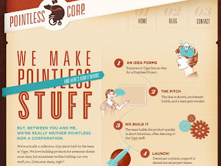
Pointless Corp
Lounge Lizard

The Ernest Hewingway Collection

Faces

Bond Makeover

Blueacorn

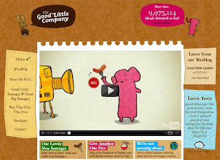
Good Little Company
Saddle Back Leather

Kevin Lucius

Wawa

Big Sweater Design

Slabovia

RIP Cube Club

Wing Cheng

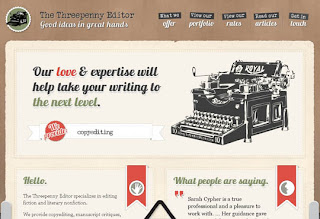
Three Penny Editor
A week ago you could have seen the post about the yellow color in the web dizyne , this time we decided to show the sites using brown.
Honestly, almost every Web site dedicated to coffee and a site in the retro style is made with the use of this color, but There are many interesting sites that pretty brown-to-face :)
Carnivale du Vin

Spreadt

Creative Payne

Epicales

Ready Made Designs

The Peach Design

Jan Ploch

Molecube

Head2Heart

Pointless Corp

Lounge Lizard

The Ernest Hewingway Collection

Faces

Bond Makeover

Blueacorn

Good Little Company

Saddle Back Leather

Kevin Lucius

Wawa

Big Sweater Design

Slabovia

RIP Cube Club

Wing Cheng

Three Penny Editor

Hey excellent post.Thanks for sharing such a good post.When selecting colors,it is important that the color portrays the message and the image of your company in all languages.Brown is closely associated with wood and to a smaller extent with stone.
ReplyDelete