
A web design is made of many different elements, each having varying levels of importance and some demanding prominence over others. Some elements share a relationship, while others are not related at all. The tricky part is being able to communicate this visually and effectively. This is where the principle of contrast comes into play.
Contrast is the difference between two or more elements. With contrast, a designer can create visual interest and direct the attention of the user. But imagine if all of the elements on a web page were the same in style and appearance. There would be no organization, no flow, and definitely no hierarchy. Content would be nearly impossible to digest. This makes contrast an essential part of effective web design.
In this article, we’re going to see how contrast can be achieved by creating differences in three aspects of design: color, size, and alignment.
It’s a given that almost all web designs have a header, a content area, and a footer. These are three completely different areas that should have a clear visual separation. Using contrast in background color is an excellent way to achieve this.
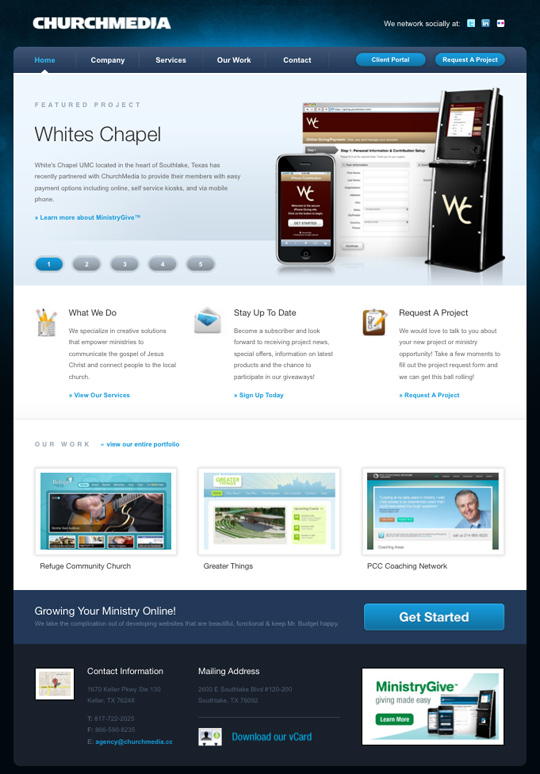
Here you will see that the Church Media Group’s website is an excellent example. The header and footer have dark background colors, while the content area is white. This clearly establishes the content as being different and even more important than the other areas. If we look a little further there is another level of background contrast within the content area. The “Featured Project” area has a light blue background. Since the amount of contrast between this area and the rest of the content is minimal, it tells us that the two are related.
Phil Renaud’s portfolio has a unique layout and an incredible color scheme. He uses a gold-yellow color to create contrast between the vertical navigation and the rest of the predominantly brown design.

Color can also be used within text to create contrast. Billy Tamplin does an excellent job of creating separation and hierarchy by giving the headings, subheadings, and paragraph text all different colors. For a blog style layout, establishing contrast between post headings and body text is critical. It helps the user easily see where articles begin and end as they scroll down the page.
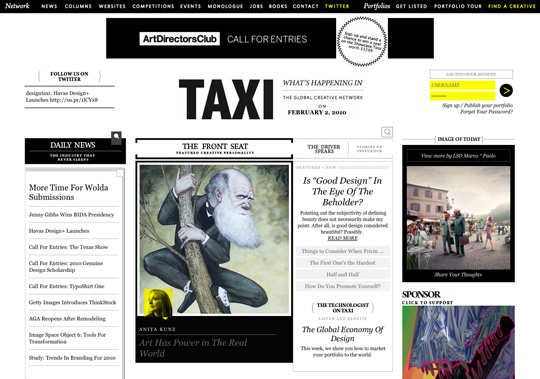
Creating contrast through size becomes very important when you can’t rely on color. Taxi has a lot going on within it’s layout and has a minimal color scheme. So in order to establish a hierarchy among the three columns, the designer used a much larger width on the middle column – over two times that of the left and right columns. This makes it apparent to the user that the middle column is the most important area of the page.
Just as color can be applied to typographic headings to create contrast, so can size. Big headings are a great way to establish hierarchy within the content of a website. The website of Imaginaria Creative, uses big headings to catch the visitor’s attention and draw them in so that they read more of the smaller paragraphs below.


LegiStyles uses a large left margin on the content blocks below each heading. Along with the the large size of the headings, this creates a good amount of contrast. If you are going to use this kind of difference in alignment, be sure to make it a big difference. Otherwise it will end looking like a mistake of poor design.
Centering large paragraphs is a big typography no-no. It makes text very hard to read. However, don’t be afraid to mix left aligned paragraphs with centered headings. It’s another good way to use difference in alignment to create contrast. Combined with a nice serif font, it can also give your typography a classic look.
Simon Collison uses centered headings paired with left aligned paragraphs in each of the content boxes. Since the font size of the headings isn’t much larger than that of the paragraphs, this helps set the headings apart.
A List Apart is another great example of using centered heading with left aligned paragraphs.


Contrast is the difference between two or more elements. With contrast, a designer can create visual interest and direct the attention of the user. But imagine if all of the elements on a web page were the same in style and appearance. There would be no organization, no flow, and definitely no hierarchy. Content would be nearly impossible to digest. This makes contrast an essential part of effective web design.
In this article, we’re going to see how contrast can be achieved by creating differences in three aspects of design: color, size, and alignment.
Contrast in Color
When most people hear the word contrast, they think of color. Even though the principle of contrast is not limited to color, it can go a long way in helping the user differentiate page elements from one another.It’s a given that almost all web designs have a header, a content area, and a footer. These are three completely different areas that should have a clear visual separation. Using contrast in background color is an excellent way to achieve this.
Here you will see that the Church Media Group’s website is an excellent example. The header and footer have dark background colors, while the content area is white. This clearly establishes the content as being different and even more important than the other areas. If we look a little further there is another level of background contrast within the content area. The “Featured Project” area has a light blue background. Since the amount of contrast between this area and the rest of the content is minimal, it tells us that the two are related.
Phil Renaud’s portfolio has a unique layout and an incredible color scheme. He uses a gold-yellow color to create contrast between the vertical navigation and the rest of the predominantly brown design.
Color can also be used within text to create contrast. Billy Tamplin does an excellent job of creating separation and hierarchy by giving the headings, subheadings, and paragraph text all different colors. For a blog style layout, establishing contrast between post headings and body text is critical. It helps the user easily see where articles begin and end as they scroll down the page.
Contrast in Size
Another way to create contrast in web design is to use size differences between elements. In other words, make some things bigger than others.Creating contrast through size becomes very important when you can’t rely on color. Taxi has a lot going on within it’s layout and has a minimal color scheme. So in order to establish a hierarchy among the three columns, the designer used a much larger width on the middle column – over two times that of the left and right columns. This makes it apparent to the user that the middle column is the most important area of the page.
Just as color can be applied to typographic headings to create contrast, so can size. Big headings are a great way to establish hierarchy within the content of a website. The website of Imaginaria Creative, uses big headings to catch the visitor’s attention and draw them in so that they read more of the smaller paragraphs below.
Contrast in Alignment
Good alignment plays a big part in creating a quality web design. Things just look better when they line up. This is why I think using different alignments to create contrast is tricky and should be used sparingly. However, when done well it can be very effective in creating separation.LegiStyles uses a large left margin on the content blocks below each heading. Along with the the large size of the headings, this creates a good amount of contrast. If you are going to use this kind of difference in alignment, be sure to make it a big difference. Otherwise it will end looking like a mistake of poor design.
Centering large paragraphs is a big typography no-no. It makes text very hard to read. However, don’t be afraid to mix left aligned paragraphs with centered headings. It’s another good way to use difference in alignment to create contrast. Combined with a nice serif font, it can also give your typography a classic look.
Simon Collison uses centered headings paired with left aligned paragraphs in each of the content boxes. Since the font size of the headings isn’t much larger than that of the paragraphs, this helps set the headings apart.
A List Apart is another great example of using centered heading with left aligned paragraphs.
Now Go and Be Different
Learning to create the right amount of contrast in your designs is just like mastering any other principle of design – it takes practice. Take time to study the work of talented designers and see how they are using contrast in their designs. Remember that contrast is all about differences. If two elements are very different in nature, be sure to make their visual differences very obvious.Related Posts
Here's some other articles that you will definitely find useful.Usability Design for Online Web Forms
Arranging and Designing Synchronized User Interfaces
20 Design Blogs Worth Reading
10 Free Online Books for Web Designers
Whitespace: The Underutilized Design Element
Thanks for sharing the such a wonderful information about the use of color combination in web designing process. A website design has to be good enough to be able to get all the exposure that the site deserves. The most important principle of web design best practices is knowing what components to use on your website and how to ensure browser compatibility.
ReplyDeleteweb design durham