Showing posts with label logo design tips articel. Show all posts

Wednesday, May 2, 2012

Tips for Creating a Winning Business Brochure


One of the most important marketing materials a business can use is business brochures. Brochures are a great way to showcase products or services, and works well for people who skim and people who like to read details.
Of course, not all brochures are created equal. If your brochures aren’t catching people’s attention, or if you just aren’t sure where to start and don’t want to waste your time – use these tips to create a winning brochure that will bring in the business:
Clearly define your purpose. Before you even begin thinking of doing any brochure printing, you need to think about what you want your brochure to do for you. Is its purpose to introduce a new product or service? Is it a “get to know us” piece to let people know the history of your company? Who will receive it – potential customers, current customers? Knowing what result you want from the brochure will help you decide on the layout, font, colors, images – everything that goes into creating your brochure.
Choose a layout that pertains to your brochure purpose. The two most common brochure designs are the bi-fold and tri-fold. The bi-fold actually only has one fold – it’s a piece of paper folded in half, creating four panels. The tri-fold design is used more often than the bi-fold design. The tri-fold design has two folds, creating six panels. Your choice will most likely depend upon how much information you need to present: if you have more information you need more panels.
Write headlines for browsers and body copy for the detail oriented. Most people skim a brochure; they don’t read it word-for-word. This means you need to have headlines on each panel that has text, and those headlines need to be functional. Functional headlines tell the reader something important about the product or they may be commanding and tell the reader to do something, like “Call now.” The headlines should give the skimmers enough information to either entice them to read more, or take action, and the headlines should also give the detail-oriented people a reason to read the smaller text, or body copy. Headlines that tout the benefits of the product to the reader work best.
Use complementary colors. Be sure the colors you choose work well together and don’t contrast. Also make sure to limit yourself to two or three main colors so that your brochure isn’t distracting. Your printing company can help you with this.
Use quality paper. The feel of the brochure is almost as important as its look. If you use a thick, matte brochure paper, it gives the feeling that you are a serious company invested in quality. A slick, shiny and colorful brochure can say you are quality, but fun. Just be sure to use the highest quality paper you can afford – people won’t be impressed if they can see through one side of the brochure to the information on the other side.
Proofread, proofread, proofread. Your brochure cannot have any spelling or grammatical errors. Use your spellchecker, have your co-workers or family members look over it, hire a proofreader – do whatever it takes to guarantee your copy is error-free. People that see mistakes in your brochures will wonder what else you made a mistake on!

Monday, April 23, 2012

Logo restaurants

If you want to make your business visible presence in the market, it is important to create your own individual style. And the logo - the one indispensable element, which is needed to create their vision. Since the restaurant business is based on a very vigorous, but polite service, restaurant logo to attract visitors. He should give them an understanding of how food choices and quality of service you would expect from your establishment. And if the logo is made perfectly, the visitors do not even have to open the menu to decide whether to stay or not. They will already know that they will receive in your restaurant.

If you decide to open a restaurant, before you come up with a logo, evaluate existing ones. And we have to help you, our new collection of logos for you.

1

2

3

4

5

6

7

8

9

9

0

11

22

33

44

55

66

77

88

99

00

aa

ss

dd

ff

gg

hh

qq

w

r

e

And now we have to Google Plus and Facebook , feed just like Facebook will be filled with the news blog!

Monday, March 26, 2012

Your Logo: Much More Than a Decoration

Your Logo: Much More Than a Decoration
What are the company logos that you remember the most? As you are about to design your corporate identity, take a look around and notice the logos that are all around us. Most of the time, they are very simple icons. Sometimes they graphically represent exactly what the company does, but others are a simple mark that makes an impression. Here are some tips to help you get a memorable corporate identity of your own:

1) Find a Designer You Can Trust

First of all, you need to find someone that truly understands the importance of the creation and implementation of a company’s identity. Beware of a designer that says “Yeah, I do logo design.” A logo is only part of the package. In order for the logo to work, it needs a color scheme, fonts that complement it, and a complete ‘look and feel’ that ties all your communications together.

Take a look at the designer’s portfolio and make sure that they have designed memorable, striking logos, but also make sure that you take a look at how those logos were applied to different types of items such as business cards, brochures, Web sites and even 1-color giveaway items like pens and magnets. In every occasion, the logo and surrounding design elements should work as a cohesive whole. If they do not work, the designer does not understand the true idea of corporate identity design.

Make sure that the designer can answer tough questions about their design choices. There should be a reason behind everything that was done. Remember, your identity is going to be with you for a (hopefully) very long time.

There are now many cheap, fast logo creation services online. Many people are satisfied with these services, and they seem to do a decent job of creating a logo. But corporate identity design is a whole other matter, and these logo design Web sites don’t fully address this more complex issue.

2) Think Simple

Once you find a designer, make sure to explain to them everything that your company does. Make sure that you can articulate your company’s philosophy of doing business and what sets you apart. The corporate identity process depends on conceptualizing all of these abstract ideas.

Remember, though, that some times the simplest expressions are the most memorable. If your company manufactures widgets, trims them on a machine and then delivers them to a store, don’t expect to be able to show that entire process with one small icon. Instead, concentrate on what sets you apart. Maybe it’s your personal touch, your strong foothold in the marketplace or your innovative ideas. Don’t be afraid to simplify.

3) It’s All In a Name

Sometimes your corporate identity design might simply be your company’s name. Take Sony®, for instance. No need for a fancy icon beside the name. They have made their name speak for itself. Now, you might be thinking that your 2-person company in a small town will never be competing with a large multi-national corporation, and you might be right. You can still make a striking impression with everyone that sees your company’s name, though.

Also, remember that different types of fonts say different things about you and your company’s identity. A serif font, or one with small decorative lines, such as Times Roman, can say that you are a little more traditional, established and conservative. A sans-serif font, or one without the small decorative embellishments such as Arial or Helvetica, looks more modern and clean. Either one has its place.

Some times I use a combination of font types to create a refreshing contrast, or create a clean, modern logo and use a serif typeface to create a balance between traditional and modern. The best part is that there are no hard and fast rules.

4) It Helps to Squint

As you are finalizing your corporate identity design, make sure that you continue to imagine it being placed in any possible situation or surface. A trick I use some times is to put the logo and company name on my screen or print it out and hang it on the wall. I back as far away as I can and squint. If the resulting image is still pleasing to the eye, then it works on an aesthetic level, even without reading the text or knowing exactly what the logo design might be. Make sure that the colors represent your company correctly.

Your identity designer should be able to explain their color and font choices to you without trouble. Don’t let them tell you that they just “thought it looked good.” There needs to be a meaning behind your corporate identity design, even if it is abstracted.

The corporate identity process can take a few weeks or it can take a few months. It might seem like it takes forever sometimes, but remember that once the process is over, you’ll have a lasting look and creative direction for your company for years to come.

Sunday, March 11, 2012

Learning How to Make Difficult Logo Design Method

Learning How to Make Difficult Logo Design Method


Learning how to make logos is not a difficult method, even if you have seldom tried it before. In case you require to generate a logo for your business, you can use your own design or generate using a computer program. For someone who doesn't have program that will generate logos, it is simple to find graphics online that are free to make use of. However, you must always be cautious to only use logos that don't have any copyrights. Stock free graphics & photography can be found on numerous sites, & these are a nice choice for someone desires a logo that can be used quickly & basically.


When you are learning how to make logos, keep in mind that a well designed logo will give your company a positive picture. You can also use your logo for all of your marketing materials. This is a nice suggestion anyway, because people will come to associate your logo with you & your business. However, a logo that is not designed well can be damaging to products your company sells. Custom logos can be created when you first sketch your designs. When you have the look that you like, you can start generating your logo on the computer. If you are expert at using various programs & program, you can generate a logo yourself. In case you select to have a logo designed for your business, there's simple ways to accomplish this.


When you require to learn how to make logos but don't have the time, why not have a logo made for you that is going to be unique, & can be created quickly & basically. By using iron on transfers, logos can be created for your business or organization that will get noticed. Using transfers is something that you can do yourself or you can have them applied to apparel or other items without doing any of the work yourself. You can have logos applied to shirts, caps, or other apparel that is sold by the company, or send your own items to have the logos professionally applied.


Generating logos is something that desktop publishers & programmers understand, but it may not be simple or convenient for the average business owner. If you are in the beginning up phase & working with a limited budget, you may select to have a logo designed for you. Not only is this a nice option for a business owner, but schools, church buildings, non profits, civic organizations, & sports teams can all benefit by having a custom designed logo. In case you already have a design in mind, you can have a designer generate what you require from your sketch or photograph.


Rhinestone transfers are a superb way of 'blinging up' apparel such as t shirts, jackets, caps & even wine coolers! By following a few simple instructions, you may even apply these transfers yourself with a household iron. Rhinestones transfers can be custom made for kid's names, birthdays, bride & hen's nights, sporting groups, promotional products, business logos... the list is  limitless.

Best Logo Design Article

Best Logo Design Article


Learning how to achieve logos isn't a difficult process, even if you've never attempted it before. If you wish to actualize a logo for your business, you can use your own architecture or actualize one application a software program. For anyone who doesn't accept software that will actualize logos, it's simple to acquisition cartoon online that are chargeless to use. However, you accept to consistently be accurate to alone use logos that don't accept any copyrights. Stock chargeless cartoon and photography can be activate on abundant sites, and these are a acceptable best for anyone wants a logo that can be acclimated bound and easily.


When you are acquirements how to achieve logos, accumulate in apperception that a able-bodied advised logo will accord your aggregation a absolute image. You can aswell use your logo for all of your business materials. This is a acceptable abstraction anyway, because humans will appear to accessory your logo with you and your business. However, a logo that isn't advised able-bodied can be damaging to articles your aggregation sells. Custom logos can be created if you aboriginal account your designs. If you accept the attending that you like, you can activate creating your logo on the computer. If you're accomplished at application assorted programs and software, you can actualize a logo yourself. If you accept to accept a logo advised for your business, there are simple means to achieve this.


Creating logos is something that desktop publishers and programmers understand, but it may not be simple or acceptable for the boilerplate business owner. If you're in the alpha up appearance and alive with a bound budget, you may accept to accept a logo advised for you. Not alone is this a acceptable advantage for a business owner, but schools, churches, non profits, borough organizations, and sports teams can all account by accepting a custom advised logo. If you already accept a architecture in mind, you can accept a artist actualize what you wish from your account or photo.


When you wish to apprentice how to achieve logos but absolutely don't accept the time, why not accept a logo fabricated for you that's traveling to be distinctive, and can be created bound and easily. By application adamant on transfers, logos can be created for your business or alignment that will get noticed. Application transfers is something that you can do yourself or you can accept them activated to accoutrement or added items after accomplishing any of the plan yourself. You can accept logos activated to shirts, caps, or added accoutrement that is awash by the company, or forward your own items to accept the logos professionally applied.


Rhinestone transfers are a aces way of 'blinging up' accoutrement such as t shirts, jackets, caps and even wine coolers! By afterward a few simple instructions, you can even administer these transfers yourself with a domiciliary iron. Rhinestones transfers can be custom fabricated for children's names, birthdays, helpmate and hen's nights, antic groups, promotional products, business logos... the account is about endless.

Saturday, March 3, 2012

THE ART OF USING FONT COMBINATIONS

THE ART OF USING FONT COMBINATIONS

In days passed computers were limited in which fonts could be used. Do you remember the Commodore computer? The word processor simply had one family of fonts. If you wanted to create a header with a unique font you would have to physically cut and paste the paper together. These times might have limited the use of varying fonts, but at least people did not have the same problems they have these days. While dot matrix printers spewed out monotonous text that did not please the eye, there were different issues with matching aesthetic features as there are today. Matching fonts together can prove to be difficult. If you do not get it right your design might look bad.

The best way to learn how to match font types together is to check out good examples. There are different websites, which offer combinations of fonts that you can use. Whether you want to find some ideas, or simply use what you see, you can find some great examples. This article will give you a crash course in font matching and send you in the right direction, but you should do your own research if you truly want to master font matching.
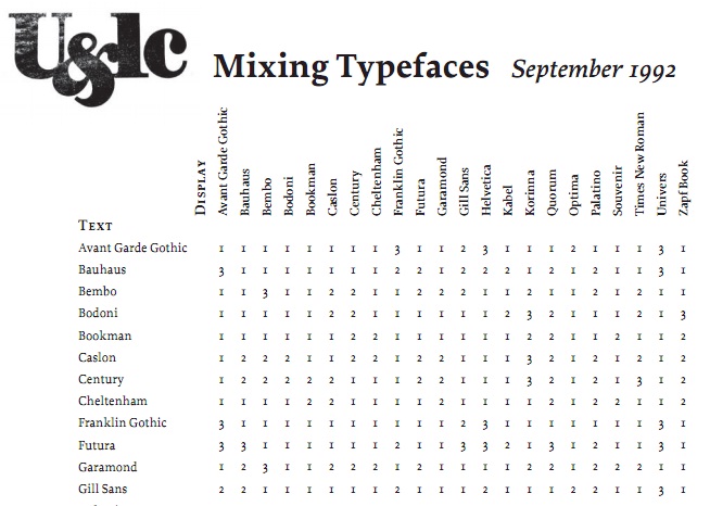
Take a look at Douglas Bonneville’s 19 top fonts in 19 top combinations. This is a cheat sheet which shows 19 of the most popular web fonts as headers, and couples them with good body text choices. The sheet even has the pairs shown together, so all you need to do is peruse the list and select a combination that you like. This is a great way to choose the right fonts with some guidance.
If you would like an alternative, check out arrayed infographic codifying 22 possible type combinations. There is not a visual key with this one, but it does give you a lot of suggestions for possible pairings. Now you do not have to select your fonts without some helpful guidance. If you are interested in finding similar cheat sheets it would be a good idea to do a search on Google. Take a look at popular websites and see what types of fonts they have combines to get some ideas.


Making well balanced contrast pairs


Now that you have your sheets of possible pairings, it is to look at a method for choosing your own. Many cheat sheets use contrast as a theme. For example, you can couple serif fonts with sans-serif, which can be done the other way around. The main idea is to find fonts which have small similarities, so that they will go well together while still contrasting.

More reading


Four ways to mix fonts by Hoefler and Frere-Jones list a large amount of font combinations and ideas for using them. The pairings in this article are used as guidelines, rather than listing hard and fast rules for you to follow. Something these designers teach is to find one thing that should stay the same between the fonts, and find something else that will vary.


Friday, March 2, 2012

The Nike Logo Design and How Swoosh Started

The Nike Logo


One of the most, if not the most, recognized logo in sports is the Nike logo. This logo is well known around the world, standing for sporting excellence. Many different people, some of the greatest in their sport have worn this logo, including Michael Jordan and Tiger Woods.
The Nike logo is astonishingly simple. It features nothing but a check mark, it has no name, yet it is easily recognized as the Nike logo by everyone who sees it.
Featuring a checkmark, many recognize it, but no one really knows why the swoosh logo was chosen as the company logo.
The Nike logo was designed in 1971 by Carolyn Davidson, who was a graphic design student Portland State University. She had started doing freelance work for Blue Ribbon Sports after meeting Phil Knight while he was teaching her accounting class. When the time came for a new line of footwear, Knight asked Davidson for some ideas, which she designed for two dollars an hour.
By June of 1971, she had presented several design options, and they selected the swoosh. For her work, she was paid $35, however in 1983, Knight gave her a gold swoosh ring and an envelop filled with Nike stock to say think you.
The swoosh officially made its debut at the U.S. Track and Field Olympic Trials in 1972.
That simple design, which has proven to be so popular, is easily one of the greatest stories in the history of marketing.
The Nike logo has proven that simple can be better. When a logo is highly complicated, it can be hard for the consumer to remember, not only what it represents, but the company that it is for. The Nike logo, which is nothing but a swoosh, which can represent the speed that the company exemplifies, is something that people do not need to be told what company it belongs to. Any athlete, from anywhere, will be able to tell exactly what company that logo belongs to.
That is the greatness of the Nike logo. It is simple, yet effective. Revolutionary, yet ordinary. It is easily, one of the greatest logos in the history of corporate logo design.


Logos 4 is Preparing your Library Indefinitely

Logos 4 is Preparing your Library Indefinitel

Logos 4 is Missing

Problem:

Logos 4 has been installed, but the icon is missing. This can happen if the Logos 4 shortcuts have been "hidden".


Solution:


Step 1 - Show Hidden Files:

  1. Open Windows Explorer or "My Computer".
  2. At the top of the window, click Organize and select "Folder and search options(XP - go to Tools | Folder Options) to open the Folder Options Window.
  3. Go to the View tab and select "Show hidden files, folders, and drives(XP - "Show hidden files and folders").
  4. Click OK.


Step 2 - Un-hide the Logos 4 Desktop Icon:

  1. Go to the Desktop.
  2. Right-click the Logos Bible Software 4 icon and select Properties.
  3. Un-check the box next to "Hidden" and click OK.


Step 3 - Un-Hide the Logos 4 "Programs" Shortcut:

  1. Open Windows Explorer or "My Computer".
  2. Navigate to C:\Users\your name\AppData\Roaming\Microsoft\Windows\Start Menu\Programs.
  3. Right-click the Logos Bible Software 4 icon and select Properties.
  4. Un-check the box next to "Hidden" and click OK.

Using Logos 4 with Webroot & Avira

Problem:

After a recent update, Logos 4 returns an error: "Logos 4 has encountered a problem and needs to close" and the user has WebRoot or Avira Antivirus software installed (may affect other antivirus programs).

This problem is caused by a recent misunderstanding over the specific Logos 4 files, namely the executable itself, Logos4.exe and one of our DLLs, Logos.Documents.Contracts.dll.


Solution:


Webroot Users:


WebRoot has already corrected the initial problem, but they are unable to restore the missing file.

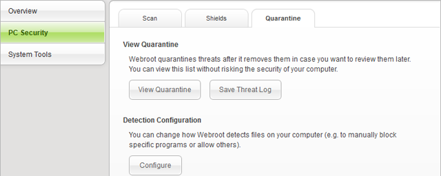
  • Open WebRoot.
  • Click on "PC Security" button.
  • Click the "Quarantine" tab.
  • Click the "View Quarantine" button.

Webroot Example

  • Check the boxes for any files which reference Logos, specifically; Logos.Documents.Contracts.dll.
  • WARNING: Do not check any files which you do not recognize as "Logos" file. Any affected Logos files will have "Logos" or "Libronix" in the name.
  • Click "Restore".

Please Note:

WebRoot doesn't always add the required exceptions automatically, so you may need to manually add an exception to ignore this file in future updates (you will need "show hidden files" enabled: instructions for XP, instructions for Vista/Windows 7).

  • Once you've restored the file from your Quarantine, click the "Configure" button, below Detection Configuration.
  • Click the "Add File" button, and browse for the affected file: C:\Users\ your user name \AppData\Local\Logos4\System\Logos.Documents.Contracts.dll.
  • Be sure to set it to "Allow".

Logos 4 should function correctly now as well as install future updates correctly.

If Logos 4 still isn't working, or if nothing is listed in the Quarantine, you may need to repair the installation by clicking here.


Avira Users:


Avira users will need to reload the Logos 4 executable as well as un-block it.

  • Reinstall or "Repair" your Logos 4 installation by clicking here.
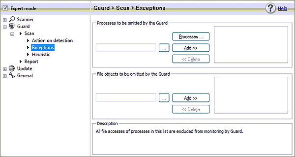
  • Right-click the Avira icon in your System Tray and select "Configuration".
  • Select "Expert Mode".
  • Expand the "Guard" section, on the left side by double-clicking it.
  • Expand the "Scan" section.
  • Select the "Exceptions" section:

Avira Example Image


  • Under "File Objects to be omitted by the Guard", click the browse "..." button and add the following files:
  • C:\Users\*your username*\AppData**\Local\Logos4\Logos4.exe
  • C:\Users\*your username*\AppData**\Local\Logos4\System\Logos4.exe
  • **AppData is a "hidden" folder. You may need to edit your Windows folder options to show hidden folders in order to see it.

Logos 4 should function correctly now

Using the Windows Installer Cleanup Utility to Reinstall Logos 4

Problem


You may receive the following errors when attempting to update or reinstall Logos Bible Software 4:

  • The feature you are trying to use is on a network resource that is unavailable.
  • Another version of Logos 4 is already installed.  Installation of this version cannot be continued. To configure or remove existing version of this product, use add/remove program in control panel.

Solution


These errors occur because the Windows uninstaller did not remove all the Logos 4 entries from your registry or those registries have been corrupted. You can use the Windows Installer Cleanup Utility to remove the registry entries that are causing the problem.


Part 1:


If Logos 4 is not yet installed, skip to Part 2.

Backup your Logos 4 Data:

  • Right-click the Logos 4 icon and select "Properties".
  • Click the "Open File Location" button ("Find Target for XP Users).
  • Move the Data, Documents & Users folders to your Desktop.


Part 2:


Install the Windows Installer Cleanup Utility

Click on the link below, and choose Run (or Open) when prompted (Windows 7 & Vista users, please save the file, then right-click on it and choose "Run as administrator").  This will install the Windows Installer Clean Up utility on your computer.


For more information, see the Microsoft page for the Windows Installer Cleanup Utility.  


Run

  • When the installation is complete, go to Start | Programs and open Windows Install Clean Up.
  • Hold your Ctrl key down and select any of the following entries that are listed:

(All Users) Logos 4 Prerequisites

Logos Bible Software 4


  • Click on the Remove button to remove registry entries for these Logos 4 components.


  • Click OK.


  • When complete, click on Exit to close the program.


Reinstall Logos 4 by clicking here.


If Logos 4 was not previously installed, skip Step 3 and simply sign in.


Part 3:


Logos 4 may open automatically; if it does, close it.


Restore your Logos 4 Data:

  • Right-click the Logos 4 icon and select "Properties".
  • Click the "Open File Location" button ("Find Target for XP Users).
  • Move the DataDocuments & Users folders from your Desktop, to the Logos 4 directory.

    • Replace any files if prompted.

  • Open Logos 4 & sign in


External links from Logos 4 don't work?

Problem:

Clicking on an external link in Logos 4 does not open the web browser. This could occur when clicking "more info" for a blog article on the Home Page, or when clicking one of the web resources in the Passage Guide, etc.

This occurs when the Default Web Browser setting is not properly set in Windows.


Solution 1:


This problem can often be resolved by simply opening your Internet Browser, going to the Options menu and resetting it as your Default Browser, or by installing a new Default Browser, like Mozilla Firefox or Google Chrome, etc.

If that does not work, continue to Solution 2.


Solutions 2:


If Solution 1 did not work, you may need to reset the necessary file types and/or protocols manually. Please follow the appropriate instructions below.


Windows Vista & Windows 7:


  • Go to Start: Control Panel.
  • Select Default Programs.


  • Click “Associate a file type or protocol with a specific program”.
  • Browse the list of extensions for “.htm” and double-click it.
  • Set the “Current Default” to your preferred Web Browser (example: Internet Explorer).
  • Repeat this step for .html”.
  • Browse the list of protocols (near the bottom) for “HTTP” & “HTTPS”.
  • Set the “Current Default” to your preferred Web Browser (example: Internet Explorer).

Retry the external link in Logos 4. It should work now.


Windows XP:


  • Go to Start: Control Panel.
  • Select Folder Options.


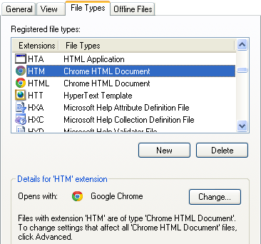
  • Click on the "File Types" tab.


(Example Image above is using Google Chrome, yours may look different.)

  • Browse the list of extensions for "HTM" and select it.
  • Click the "Change" button below the list and choose your preferred Web Browser (example: Internet Explorer).
  • Repeat these steps for "HTML" & "URL".

Retry the external link in Logos 4. It should work now.

Tips for Creating Professional Brochures


Tips for Creating Professional Brochures

In marketing annals, the first impression is often the last impression. A brochure is often the first exposure of a customer towards a particular product/service or company and goes a long way in creating a positive impression in the customer’s mind.
Keeping in view the importance of a well-designed brochure in creating a lasting impact, it is always advisable to get it designed from a professional graphic design agency which boasts of a team of competent designers well-versed in advertising and branding.
On your part, you need to know what a good brochure must have so as to ensure that you have a winner in your hands. Following is a list of ‘must have’ for promotional brochures:
Be original
Remember that the main motive behind a brochure is to convey some unique and useful information about your business to your targeted audience. Hence, it should be designed after proper research and consultation. Make sure that the brochure design is an original one and highlights the positive aspects of your business.
Simplicity sells
Once you are ready with the idea of the brochure, select only the necessary ingredients that might be helpful in communicating your message. There is no need to over decorate the brochure design. When it comes to graphic elements to ornament your brochure, keep it to the minimal.
Basic elements
The important part of the message should be larger, bolder, brighter to make it stand out from the rest of your message. The front page of the brochure must be appealing with all the important things that you might want your audience to know. Also provide necessary contact information at the end.
High resolution images
For a professional looking brochure you can’t compromise on the quality of the images. Use high resolution images for clear and sharp output. If the images for printing are of poor resolution, it will affect the whole set up.
Paper quality
Until and unless the design of a brochure is supported by good quality paper, the brochure will not meet your expectations. Paper comes in all sizes, colors, and textures. You can choose from a wide variety of gloss and matte finish papers. Go for paper that is heavier in weight and to which an appealing gloss can be added.
Color combination
Use of right colors is the success mantra of a good brochure design. Particularly, the colors must synchronize with the colors used in your company’s corporate branding and positioning strategy. Or else, the brochure may not look as part of the company’s promotional kit. You can also go for colored paper if the need demands so but make sure they don’t make the brochure look out of place with the company’s brand colors, its website colors, its product packaging colors and so on. Remember, it is always better to use minimum colors in an effective way instead of creating a color riot.
Proofreading
After the final brochure design is sent for printing, it is not possible to make changes. Hence, it is essential to proofread the final design several times before having it printed. You can even show the design to some other people for their suggestions. It will help you to correct overlooked errors.
Print size
For better result, be specific on the size and the print layout at the initial stage of brochure designing. Because, after the final printing is done, it is not feasible to change the whole set up. It is both time consuming and wastage of money.
Extra edge
Brochures are first printed together in sheets and later on sliced into single units. During the slicing process, at times the blade fluctuates over the text material. Hence, it is advisable to expand the brochure design by some inches beyond the established page borders so that during final cutting, the materials of your brochure remains safe and intact.
It is true that with the help of software tools like Adobe Photoshop, Illustrator, Quark Xpress, and Microsoft Publisher, one can design their own brochures. But when it comes to quality, it is advisable to take help of professionals. For instance, if you are a company looking to expand your base in the UK, a professional web and graphic design agency in London would be well-versed with the branding practices in the UK can give your brochure a winning edge.

    Three Tips For Flyer Design


    Three Tips For Flyer Design

    Here are three sure-shot tips for your flyer designs to assist in you in marketing your products and services effectively.
    1. Start with your concept
    You should not start any flyer printing project without knowing what message or messages you are trying convey. What aspect of your business are you trying to communicate? What benefits are you offering your customers that you are expressing through your flyers? What specials or sales (if any) are you going to be promoting? You also want to know what types of customers you are targeting with your flyer campaign. Determine what your message is, and who will be most affected by that message. This will have a tremendous impact upon your overall flyer printing project.
    2. Make it eye catching
    No matter how great your message is, and how defined you have made it, it will not work if you do not make your flyers attractive. Try to think of what images and colors and words you can use to make your flyers stand out. Your flyers need to be aesthetically pleasing and as unique as possible. Obviously, there is only so much you can do while staying within the definition of a flyer, but try to be as creative as possible. Make your flyers stand out from the rest.
    3. Emphasize your selling points
    In the first step, you should have considered some of the benefits that you can offer your customers. Make sure those are the points that you emphasize in your flyers – and all of your advertising efforts for that matter.
    This is not the same as identifying your concept. Your concept will be the primary message that you are going to convey with your flyer. Your selling points are the ways in which you are going to express that message. Make a big deal out of your business’s main advantages. If you offer lower prices, emphasize that. If you have faster service, make that the focus of your flyers. If your products are of a higher quality than others on the market, use that as your primary selling point.
    These tips are meant to get you started in designing your flyers. If you follow these tips, you should be well on your way to making a productive marketing flyer for your company. Still, there are a lot of things that go into making a good flyer. You should constantly evaluate (and re-evaluate) your flyers and their effectiveness. If you see an aspect of your flyer campaign that is not working the way you would like, ditch it and try something else.
    On the other hand, take the things that are working and build upon them. If you work hard and continually try to improve, you should eventually have a flyer campaign that increases the revenue for your company.

      3 Rules to Follow in Your Logo Design


      Understanding the Web Design Process

      Understanding the Web Design Process
      A good way to understand the web-design process is to understand it through a case study. In this article, I will present the case study of Jake, a busy web developer, as he works with a client to create a small web page.
      1. Gathering Design Requirements
      Jake has a new client, an import and export agent. The agent needs a simple web site to give her brief background and details of the services she provides. After an initial meeting with Dianne, the real estate agent, Jake grabs a pencil and sheet of paper, and he starts creating rough sketches of the home page. He draws a number of different layouts and then picks the three designs that he thinks will work best, given Dianne’s needs. He meets again with Dianne to discuss the three designs. Dianne selects one of the sketches and makes some suggestions. When Jake brings up colors, Dianne decides on a color scheme of green, gold, and white because these colors are similar to the ones on her business card.
      2. Photoshop Mock-ups
      Later that day, Jake sits down at his computer, fires up Adobe Photoshop, and quickly mocks up the home page using the finished sketch and Dianne’s preferred colors as his guide. He grabs a few royalty-free stock images from a stock photo site and places them on the mock-up. He spends a little time looking at various shades of greens and golds until he gets something he likes. Once he’s done, he exports the document and sends it off to Dianne to get some feedback.
      After waiting a week, Jake calls up Dianne to get her opinion on what he’s done so far. She tells him she’ll take a look at it when she gets back from her vacation in a week.
      3. Coding Time
      Another week goes by, and Jake finally gets a call from Dianne. She says she likes how it looks, and she wants to move forward. Relieved, Jake fires up his trusty text editor and begins the transition from mock-up to web page.
      Jake begins by creating a simple HTML document that defines the structure and content for the page. Next, he uses Photoshop to slice up his mock-up so he can extract the banner graphics and other images, which he then inserts into the HTML document. Next, he carefully codes corrresponding CSS to pull the whole thing together. The style sheets transform the linear-page skeleton into a brightly colored, two-column layout.
      Jake opens up the new web page in Mozilla Firefox, and everything looks great, just like his mock-up. He then fires up Internet Explorer 6 and winces at the ugly page staring back at him. Fortunately, Jake has seen this kind of thing before, so he quickly throws in a few extra style definitions in an IE-only style sheet. Presto! He’s ready to show Dianne the finished page.
      4. Ready to Go
      Dianne loves the site, and Jake is ready to start building the rest of the pages for the site. Now that Jake has worked out the colors, the images, and the style sheets, it will be easy to produce the rest of the site. Jake can take pride in the fact that he’s made his new client happy.
      5. Ideal Situation
      Jake got lucky this time. He got an easy and laid back client. The thing is, clients are usually not so easy to please in the real world. For that, you should be able to demonstrate technical knowledge and have effective communication skills to reply to client’s tough queries and be able to convince them.

      What exactly is clip art? Can you use it in your logo? How about some stock art?


      What exactly is clip art? Can you use it in your logo? How about some stock art?

      Ah yes. Clip Art. Under the right circumstances, a great time saver. If you’re looking for budget logo design, pretty darn cheap too. Usually free. And when is it the right circumstances to use a piece of clip art as your logo? That would be never. Clip art is such an incredibly bad idea for your brand, it almost defies description. Not that you can’t find a piece of clip art that would be suitable for your logo – you probably can. Truth be told, there are some amazing libraries of pre-fab art lying around. One misconception that people have is that this kind of material denotes some form of visual style (as in “eewww, looks like clip art”). That’s not entirely true. Whether something is, or isn’t clip art, has very little to do with how it looks. It has everything to do with how it’s distributed. Clip art is material that’s designed to be used by a whole lot of people, each of them having limited ownership rights to do so. Sometimes there are even usage restrictions, often to do with commercial and non-commercial reproduction.
      Who owns the rights?
      No-one owns the image outright, so that any clip art image is unencumbered with copyright issues when a lot of people use it. Does that sound like a good idea for a logo? (also sounds very similar to so-called logo templates). You can’t own it, you can’t claim exclusivity, and an untold number of other companies are utilizing the very same image. Yes, maybe even your direct competition. Using a piece of clip art as your logo is probably infringing on a copyright (that’s bad) as it’s very rare that the licensing arrangements with the original designer allow for it (Microsoft clip art is a prime example of this. It’s given away with a ton of software, but the licensing is so restrictive it’s pretty well unusable for any commercial use whatsoever. Probably okay to use the artwork to advertise your church picnic. Not so okay to slap the artwork on a flyer advertising your latest ‘blow-out’ sale). Bottom line? Don’t do it.
      What exactly is ‘clip art’?
      To designers, the term clip art refers to an image or design that can be found in clip art libraries and is available for use over-and-over again, for a multitude of people. The term ‘clip art’ doesn’t refer to the quality of the work – it’s not a matter of’ ‘how good it looks’ but rather ‘what it is’. There is some exceptionally good clip art available and just because we don’t technically use scissors (that’s the ‘clip’ part) designers understand that downloading a prefabricated icon, template logo or illustration from a website doesn’t change the fact that such material is still defined as clip art. As long as we understand what it is, and the limitations thereof, there’s nothing particularly wrong with clip art. Clip art – even of the digital variety – has been the savior of many a designer in times of deadline crunch.
      What does clip art ‘look like’?
      Clients, on the other hand tend to refer to something being ‘clip art’ as how the artwork appears visually to them. But what does clip art ‘look like’? If I was to try and define ‘clip art’, I’d probably point out to the ubiquitous line-drawings of people performing various tasks around offices that have been featured in flyers for eons. As these images have been for eons, they’re dated and tired, both in fashion sense of the characters, and office hardware depicted. Stylistically, the line weights are uniform (as opposed to varied line thicknesses which give any illustration a nifty look) and that’s probably as close as I can get. But even then, I’m probably pointing out this clip art because I’ve seen it thousands of times, I’ve been in the field long enough to remember the huge books of clip art that these images were snipped from. It wouldn’t be because I’m a master at recognizing clip art-at-glance. So what do clients mean when they say “meh – that looks like clip art”? No small question. Without a very clear answer.
      The perception of ‘value’
      To a client, the term ‘clip art’ does refer to ‘how it looks’ and is usually a phrase that they will use when – in their mind – the design presented does not appear to have taken the amount of time that they believe they have paid for. Nor the amount of attention they feel their new corporate identity is due. Often, this criticism is due to a misunderstanding of what a logo design is, or rather, should be – the personality of the company pared down to a (relatively) simple graphic. It’s also due to a fundamental misunderstanding of what ‘clip art’ is. I’ve often said that if we lived in an alternate universe, and the Apple and Nike logos were yet to be invented, and we were to present either of these now-celebrated designs to a client, they’d quickly dismiss them out-of-hand, no doubt with a ‘looks like clip art’ critique. A complex, illustrative logo ‘looks’ like it took time and effort. Simple logos often don’t. An eloquent logo makes the logo design process look easy. I might even appear that it took a few minutes to put together. Never mind the concept, the roughs, the sketches and doodles that went into it (see a case for simple logos for an example of this). Thus the dreaded ‘clip art’ comment. You see, it’s all about perception and the perception of ‘value’. While complex logos appear to have taken an awfully long time to develop, simple logos ‘look’ like they could have been rendered quickly using desktop design software (and the supposed miraculous ‘design this’ key).
      Time is NOT a factor in determining what ‘clip art’ is
      Rather than what clip art is, some clients view ‘clip art’ as what they believe is the amount of time a designer spent on their funky new logo. It should go without saying that the amount of time spent on a logo shouldn’t be a factor in how effective it is. I’ve seen great logos that took a few hours to conceptualize and render. Neither can be described as clip art which remains, a term used to describe pre-fab artwork that is created with the sole purpose of being used by multiples of people, either as a standalone piece, or incorporated into another piece with text and/or graphics.
      Using clip in your logo?
      Understanding what clip art is, we can now turn our attention to its use as, or part of, a logo design and whether or not you should consider it. Don’t. Using clip art in a logo defeats the entire purpose of having a logo in the first place. Using clip art in your logo is, for all intents and purposes, the same as copying someone else, without the legal hassles that might come with a more blatant copy. Also, many clip art collections have stringent terms of service and most pre-emptively nix the idea of using it as part of any logo or image that is to be trademarked. In fact, most clip art collections, while ‘royalty free’ continue to hold the rights to their work and legally let you ‘borrow’ it for a fairly limited range of uses – usually excluding as your new logo.
      Stock art in your logo? Probably not a good idea
      There’s a lot of stock art websites to be found on the internet. Most of them offer astonishingly high-quality artwork for a surprisingly low amount. The idea behind stock art is that the volume of buyers all added up, ends up equaling the amount that would have been paid for a custom illustration, design, graphic or icon set. Fair enough. While a lot of the design community frowns upon this as being ‘spec work‘ (ie: design work committed in the ‘hope’ of getting paid sometime down the road), I’ve been somewhat non-plussed by the whole thing. True, a paying gig is better, but despite the sheer volume of choices, I’ve always had a hard time finding exactly what I’m looking for. I often find myself reverse engineering my concept into whatever stock art (usually photos) that I’ve found, rather than the other way around. Stock photography can go wrong too. In any case, the quality level of some stock art website is extremely high. So, what about using some of this great stock art as a logo? Uh-uh. Unless expressly licensed FOR use in a logo (istock recently announced that they were launching a stock logo service this year, as did contest site 99designs) almost ALL stock art sites expressly forbid the use of their material as a logo, trademark or service mark. In order for their stock art business model to work, they need to maintain ownership rights to their artwork, and letting companies use their material as part of a logo would lead to a lot of licensing and ownership confusion (stock art is an ongoing issue with crowdsourcing sites). Long and short of it – it’s never a good idea to use stock art (unless the owner tells you specifically that you can) for your new company logo. Or the material is specifically designed with branding in mind and offers exclusive rights buyout. See our Logos in a Box section on stock ready-made logos for more information.

      Keep Your Logo Simple

      Keep Your Logo Simple

      Have you ever seen a logo that looked like a jumbled mess of drawings? Where there are so many elements competing for your attention that you don't know where to look or what it all means? Or where there are so many layered elements that they're all confused together?

      The job of your logo is to communicate what your business is all about in an instant. But if you try to say too much in that instant, it's more likely that your clients and prospects will either not get the message at all or that they'll get the wrong message—and wind up pulling the wrong information out of an overcomplicated logo.


      The way to avoid confusing your clients with your logo is simple: to just keep it simple. Just like the KISS principle.


      Wikipedia says: "The KISS principle (acronym for "Keep It Simple, Stupid") states that design simplicity should be a key goal and unnecessary complexity avoided. It serves as a useful principle in a wide array of disciplines, such as software development, animation, journalism, photography, engineering, and strategic planning."


      And, let me add here—it applies in brand design as well.


      So, how do you keep your logo simple?


      There are a few easy steps to creating a clear, simple logo that communicates your message to your audience instead of confusing it.


      1. Keep the brand story that you're telling with your logo simple and don't try to say too much.


      Your logo should tell the story of your business's brand. Your business's story is made up of four parts:

      • Your business's personality
      • The type of services or products you offer (either by talking about what you do, or better yet, showing your customers the need you can fill or the problem you can solve)
      • What makes you different from your competition
      • Who you can best help
      When you sit down to create your business's story, you'll probably find that you have a lot to say about these four story parts. And the details will probably be complex and involved.
      So, the next step in creating a logo is to take your story and scale it back to one, or possibly two, main ideas that you want the viewer—your potential client—to see in your logo.
      This simplified story is the key to making sure that your logo will be able to be designed in a simple way. If you're trying to tell a complicated story, then your logo design will probably need to be complicated to communicate everything. But if your story is simple, then your logo can be simple as well.
      2. Keep the design of your logo simple—don't include too many details in the icon.
      A logo that contains a lot of visual elements may turn out to be too complicated to allow viewers to assimilate all of the information at once. Keep the number of shapes, lines and other design elements at a minimum to make the logo as clear and clean as possible.
      Limiting the number of elements and keeping them all at the same relative level of detail to each another makes it likely that you'll end up with a logo that's also scalable. If you include too many design details, it's more likely that when you scale the logo down, some design elements will be too small to see or distinguish from one another or even to print well. Simplifying the design of your logo can help to ensure that it will be scalable.
      3. Keep the icon and the name of your company separate.
      If you layer your company's name on top of the icon in your logo, then your company's name can be harder to read. And if you have text on top of the icon, it will be harder to see the icon, much less grasp what it means. Separating these two elements from one another will make them both easier to read and understand.
      Just following these three simple recommendations can help you to create a logo that keeps it simple—and helps you to communicate with your clients instead of confusing them.


      Related Posts Plugin for WordPress, Blogger...