It seems to us that you have already met on the Internet navigation menus in the form of lava-lamp (developed with the help of jQuery-plugin). Today we want to teach you how to create the same effect with pure code CSS3 (without js). Today we use the transitions in CSS3 (for animation elements). So, if you're ready, we can start.
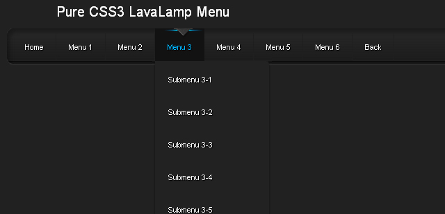
Here you can see an example and download the source:
View demo | Download the archive
As usual, begins with the development of HTML. We offer you the HTML-code for our menu of UL-LI-elements. The most interesting part of the development will be in the CSS-code.
index.html
Step 2 - CSS
Now let's move on to CSS-code for our menu-lamp.
css / menu.css
Conclusion
We hope you enjoyed this navigation menu, and you will find a use for it in future projects. Do not forget to comment on our today's lesson! Good luck to you! Comments (0)
 Comments (1)
Mozilla: Firefox 3.5 +
Webkit: Chrome, Safari 3 +
Opera 7 +
Internet Explorer 9
EXAMPLE 1: MEDIA QUERY THAT THE BACKGROUND COLOR OF AN ELEMENT < DIV > DEPENDENT ON THE SCREEN.
First go to the demo page and resize the browser window from very large to very small.
THE CSS ARTICLE_STYLES.CSS
 Comments (0)
12 tools to facilitate the process of working with CSS3

Here you can see an example and download the source:
View demo | Download the archive
Attention! You can view this text.Step 1 - HTML
As usual, begins with the development of HTML. We offer you the HTML-code for our menu of UL-LI-elements. The most interesting part of the development will be in the CSS-code.
index.html
<ul id="nav">
<li><a href="http://www.script-tutorials.com/">Home</a></li>
<li><a class="hsubs" href="#">Menu 1</a>
<ul class="subs">
<li><a href="#">Submenu 1</a></li>
<li><a href="#">Submenu 2</a></li>
<li><a href="#">Submenu 3</a></li>
<li><a href="#">Submenu 4</a></li>
<li><a href="#">Submenu 5</a></li>
</ul>
</li>
<li><a class="hsubs" href="#">Menu 2</a>
<ul class="subs">
<li><a href="#">Submenu 2-1</a></li>
<li><a href="#">Submenu 2-2</a></li>
<li><a href="#">Submenu 2-3</a></li>
<li><a href="#">Submenu 2-4</a></li>
<li><a href="#">Submenu 2-5</a></li>
<li><a href="#">Submenu 2-6</a></li>
<li><a href="#">Submenu 2-7</a></li>
<li><a href="#">Submenu 2-8</a></li>
</ul>
</li>
<li><a class="hsubs" href="#">Menu 3</a>
<ul class="subs">
<li><a href="#">Submenu 3-1</a></li>
<li><a href="#">Submenu 3-2</a></li>
<li><a href="#">Submenu 3-3</a></li>
<li><a href="#">Submenu 3-4</a></li>
<li><a href="#">Submenu 3-5</a></li>
</ul>
</li>
<li><a href="#">Menu 4</a></li>
<li><a href="#">Menu 5</a></li>
<li><a href="#">Menu 6</a></li>
<li><a href="http://www.script-tutorials.com/pure-css3-lavalamp-menu/">Back</a></li>
<div id="lavalamp"></div>
</ul>
Step 2 - CSS
Now let's move on to CSS-code for our menu-lamp.
css / menu.css
#nav,#nav ul {
list-style: none outside none;
margin: 0;
padding: 0;
}
#nav {
background: url('menu_bg.png') no-repeat scroll 0 0 transparent;
clear: both;
font-size: 12px;
height: 58px;
padding: 0 0 0 9px;
position: relative;
width: 957px;
}
#nav ul {
background-color: #222;
border:1px solid #222;
border-radius: 0 5px 5px 5px;
border-width: 0 1px 1px;
box-shadow: 0 5px 5px rgba(0, 0, 0, 0.5);
left: -9999px;
overflow: hidden;
position: absolute;
top: -9999px;
z-index: 2;
-moz-transform: scaleY(0);
-ms-transform: scaleY(0);
-o-transform: scaleY(0);
-webkit-transform: scaleY(0);
transform: scaleY(0);
-moz-transform-origin: 0 0;
-ms-transform-origin: 0 0;
-o-transform-origin: 0 0;
-webkit-transform-origin: 0 0;
transform-origin: 0 0;
-moz-transition: -moz-transform 0.1s linear;
-ms-transition: -ms-transform 0.1s linear;
-o-transition: -o-transform 0.1s linear;
-webkit-transition: -webkit-transform 0.1s linear;
transition: transform 0.1s linear;
}
#nav li {
background: url('menu_line.png') no-repeat scroll right 5px transparent;
float: left;
position: relative;
}
#nav li a {
color: #FFFFFF;
display: block;
float: left;
font-weight: normal;
height: 30px;
padding: 23px 20px 0;
position: relative;
text-decoration: none;
text-shadow: 1px 1px 1px #000000;
}
#nav li:hover > a {
color: #00B4FF;
}
#nav li:hover, #nav a:focus, #nav a:hover, #nav a:active {
background: none repeat scroll 0 0 #121212;
outline: 0 none;
}
#nav li:hover ul.subs {
left: 0;
top: 53px;
width: 180px;
-moz-transform: scaleY(1);
-ms-transform: scaleY(1);
-o-transform: scaleY(1);
-webkit-transform: scaleY(1);
transform: scaleY(1);
}
#nav ul li {
background: none;
width: 100%;
}
#nav ul li a {
float: none;
}
#nav ul li:hover > a {
background-color: #121212;
color: #00B4FF;
}
#lavalamp {
background: url('lavalamp.png') no-repeat scroll 0 0 transparent;
height: 16px;
left: 13px;
position: absolute;
top: 0px;
width: 64px;
-moz-transition: all 300ms ease;
-ms-transition: all 300ms ease;
-o-transition: all 300ms ease;
-webkit-transition: all 300ms ease;
transition: all 300ms ease;
}
#lavalamp:hover {
-moz-transition-duration: 3000s;
-ms-transition-duration: 3000s;
-o-transition-duration: 3000s;
-webkit-transition-duration: 3000s;
transition-duration: 3000s;
}
#nav li:nth-child(1):hover ~ #lavalamp {
left: 13px;
}
#nav li:nth-child(2):hover ~ #lavalamp {
left: 90px;
}
#nav li:nth-child(3):hover ~ #lavalamp {
left: 170px;
}
#nav li:nth-child(4):hover ~ #lavalamp {
left: 250px;
}
#nav li:nth-child(5):hover ~ #lavalamp {
left: 330px;
}
#nav li:nth-child(6):hover ~ #lavalamp {
left: 410px;
}
#nav li:nth-child(7):hover ~ #lavalamp {
left: 490px;
}
#nav li:nth-child(8):hover ~ #lavalamp {
left: 565px;
}
Conclusion
We hope you enjoyed this navigation menu, and you will find a use for it in future projects. Do not forget to comment on our today's lesson! Good luck to you!
 Comments (0)
Today, there are a thousand ways to create a button, to understand their essence, you only need to spend some time looking at the work site dribbble.com . Most of these examples are very similar to each other, but from time to time come across such a button, the creation of which have spent a little more attention, time and effort. advantage of the wonderful options CSS3, we can create an elegant and stylish buttons without much effort (including older browsers of course). Whether you're creating the button directly in the CSS or use special tools to create them, you should always think carefully about how your button will look like in the context of the Web site.
You can always download a ready set of buttons that some very kind person put it to the network. But why not sit down and think about what you can create something more original. I present you the 10 simple points, which I always take into account when creating the button. I'm not going to share ideas on how to use layer styles in Photoshop, but tell on the basic principles that will help you in your projects.
A. Relevance Brand
It is important that your buttons fit for the context. This could mean a deliberate choice of colors and graphic style and use of logo design to create a button. Perhaps, your logo has a form that can be used effectively.
If the interface used mostly flat colors, the big shiny button, a la Apple - not the best option. If possible, use the logo design to create an interface, use the appropriate forms, colors, and other forms of jewelry.
2. Match content
Remember that you need a start not only on the logo, but also on the interface as a whole. It happens that the buttons can be buttons, for example, only on smartphones, or Web applications, but perhaps on a website they can come up with a replacement.
Three. enough contrast?
With so many interface design, inspired by the style of Apple, the button can be lost among the other elements of the UI, losing its purpose. Try to experiment with colors, sizes, margins and fonts, so the buttons stand out in the interface.
4. rounded or shaped buttons?
If the interface has too many buttons with rounded corners may have to change their shape, to make them, for example, circular. This will give a contrast that will attract users' attention and urge them to push the button.
Five. Hide minor elements
You should always keep in mind that minor items do not have much to stand out from all interfaces. For example, menu items, controllers or different runners may be at equal angles (of radius), but with different shadows, borders, gradients, etc.
6. Stroke and the boundary
The majority of buttons there are something like a border or stroke. If the button is darker than the background, the stroke color to be darker than the color of a button. If on the contrary, ie, background is dark, the stroke should be darker than the background. In my opinion, this rule - the most important thing when it comes to borders and strokes.
7. Be careful with soft shadows
For a long time I am motivated by the "Law of Shadows." This law states that any shadow work most effectively when the item is lighter than its background. If the element is darker than its background, the shade should be used carefully.
Eight. icons to help you
Use small icons (for example, arrows) helps the user to predict what will happen after clicking on the button.
For example, the arrow to the right may mean that the user moves to the next page or even leaving it. Arrow down - there will be a drop-down menu.
9. Remember the primary, secondary and tertiary elements
If you create an interface with a variety of different functions, it is important to establish a visual language, defining the primary, secondary and tertiary styles.
Save for the primary keys are the strongest colors, and the decreasing importance of the buttons, use the weaker. Also do not forget to reduce the size of the button, white space, text size and levels embossing to reduce the visual weight of the buttons.
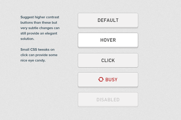
10. Specify the state of the button
For some it may seem obvious, but it is always desirable to indicate the current state of the button. User chooses to have an idea at what stage is currently in the button. This can be done with the help of these parameters CSS, like shadows, borders and gradients.
Conclusion
There is nothing wrong with using prefabricated elements UI, it is obvious that it saves a lot of time. Can even a situation that you have found the perfect item that fits you at 100% (and totally free). Nevertheless, I think it is worth remembering the basic rules to create buttons that will ensure successful and effective interface. PS I am pleased to accept in a personal comment about the translation. Thank you!
You can always download a ready set of buttons that some very kind person put it to the network. But why not sit down and think about what you can create something more original. I present you the 10 simple points, which I always take into account when creating the button. I'm not going to share ideas on how to use layer styles in Photoshop, but tell on the basic principles that will help you in your projects.
A. Relevance Brand
It is important that your buttons fit for the context. This could mean a deliberate choice of colors and graphic style and use of logo design to create a button. Perhaps, your logo has a form that can be used effectively.
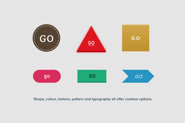 |
The shape, color, texture, patterns and fonts offer a great field for creativity.
|
2. Match content
Remember that you need a start not only on the logo, but also on the interface as a whole. It happens that the buttons can be buttons, for example, only on smartphones, or Web applications, but perhaps on a website they can come up with a replacement.
Three. enough contrast?
With so many interface design, inspired by the style of Apple, the button can be lost among the other elements of the UI, losing its purpose. Try to experiment with colors, sizes, margins and fonts, so the buttons stand out in the interface.
 |
Important keys need to be contrasted.
|
If the interface has too many buttons with rounded corners may have to change their shape, to make them, for example, circular. This will give a contrast that will attract users' attention and urge them to push the button.
Five. Hide minor elements
You should always keep in mind that minor items do not have much to stand out from all interfaces. For example, menu items, controllers or different runners may be at equal angles (of radius), but with different shadows, borders, gradients, etc.
6. Stroke and the boundary
The majority of buttons there are something like a border or stroke. If the button is darker than the background, the stroke color to be darker than the color of a button. If on the contrary, ie, background is dark, the stroke should be darker than the background. In my opinion, this rule - the most important thing when it comes to borders and strokes.
7. Be careful with soft shadows
For a long time I am motivated by the "Law of Shadows." This law states that any shadow work most effectively when the item is lighter than its background. If the element is darker than its background, the shade should be used carefully.
Eight. icons to help you
Use small icons (for example, arrows) helps the user to predict what will happen after clicking on the button.
For example, the arrow to the right may mean that the user moves to the next page or even leaving it. Arrow down - there will be a drop-down menu.
9. Remember the primary, secondary and tertiary elements
If you create an interface with a variety of different functions, it is important to establish a visual language, defining the primary, secondary and tertiary styles.
Save for the primary keys are the strongest colors, and the decreasing importance of the buttons, use the weaker. Also do not forget to reduce the size of the button, white space, text size and levels embossing to reduce the visual weight of the buttons.
 |
A variety of styles of buttons may play into the hands of
|
For some it may seem obvious, but it is always desirable to indicate the current state of the button. User chooses to have an idea at what stage is currently in the button. This can be done with the help of these parameters CSS, like shadows, borders and gradients.
Conclusion
There is nothing wrong with using prefabricated elements UI, it is obvious that it saves a lot of time. Can even a situation that you have found the perfect item that fits you at 100% (and totally free). Nevertheless, I think it is worth remembering the basic rules to create buttons that will ensure successful and effective interface. PS I am pleased to accept in a personal comment about the translation. Thank you!
 Comments (1)
In CSS2 we had the possibility for different media types such as screen, print individual style sheets to a web page link. CSS3 goes one step further with the so-called media queries. Media queries are expressions that you can add to a media type, which tells you that certain CSS rules only apply to devices that meet certain conditions specified in the media query. For example you can separate lines or separate stylesheets style designs for large screens (desktop, labtops), or just for small screens of mobile phones, smartphones and tablets. The main benefit is that you no longer need to remember content to devices with small screens because you much more flexibility in customizing the screen layout for different resolutions. Below is an example of how a media query might look there. The significance of these media query in browser windows with a horizontal resolution of 700 px or less the background color of all the DOM elements with class = "foo" red (# ff0000) is.
@ Media screen  and ( max-width : 700px ) {
  . Foo {
      background : # f00 ;
   }
}
If you in the head section of your HTML document to link to an external stylesheet (example.css) then you write:< link rel = "stylesheet" media = "screen and (max-width: 700px)" href = "example.css" /> kBROWSER SUPPORT
Mozilla: Firefox 3.5 +
Webkit: Chrome, Safari 3 +
Opera 7 +
Internet Explorer 9
EXAMPLE 1: MEDIA QUERY THAT THE BACKGROUND COLOR OF AN ELEMENT < DIV > DEPENDENT ON THE SCREEN.
First go to the demo page and resize the browser window from very large to very small.
THE CSS ARTICLE_STYLES.CSS
. Container {
  border : solid  1px  # 666 ;
  padding : 5px  10px ;
  margin : 40px ;
}

@ Media screen  and ( max-width : 600px ) {
  . Foo {
  background : # 11a456 ;
  : # 000 ;
  }
}

@ Media screen  and ( min-width : 900px ) {
  . Foo 2  {
  background : # 00F ;
  : # FFF ;
  }
}

/ * Min-width and max-width * /
@ Media screen  and ( min-width : 600px ) and ( max-width : 900px ) {
  . Foo 3  {
  background : # f00 ;
  }
}

/ * Max width device * /
@ Media screen  and (max-device- width : 480px ) {
  . Iphone {
  background : # aaa ;
  }
}
THE HTML CODE< html >
< head >
< title > CSS3 Media queries
< meta http-equiv = "Content-Type" content = "text / html utf-8" />
< link href = "css / articles_styles.css" rel = "stylesheet" type = "text / css" media = "screen" >
< body >
< div class = "foo container" >
This element is green when the browser window smaller than 600px
< div class = "foo2 container" >
This element is blue when the browser window is larger than 900px
< div class = "foo3 container" >
This element is red when the browser window is larger than but smaller than 600px 900px
< div class = "foo4 container" >
This element is gray if the display on a mobile device is smaller than 480px
< / body >
< / html >
 Comments (0)
12 tools to facilitate the process of working with CSS3
by Muhammad Asif in
CSS3,
Inspirations,
web design
CSS3 is a big step forward in the development of CSS. C its help you can create great effects on web pages without the headache.
This article presents 12 tools to facilitate work with CSS3.
CSS Pie
Unfortunately, Internet Explorer 6/8 practically does not support CSS3. Some customers in the creation of a site may need to make it look the same in IE and in modern browsers. In this case, come to the aid CSS3 Pie: it allows you to use almost all the new CSS3 in Internet Explorer.
CSS3 Builder
C using this application can be designed CSS3 rectangles visually using an interface similar to interface of Photoshop. It definitely helps to save time.
Generator shadow CSS3
Very simple tool for visually creating shadow CSS3. Once the creative process is completed, the code can be copied into your stylesheet.
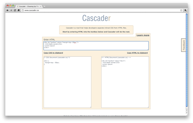
Cascader
This tool is designed not only for CSS3. Cascader analyzes the code HTML, reveals the built-in properties CSS, removes them from the HTML code and adds a separate style sheet. A very useful tool for those who adhere to the separation of code.
Border-radius.com
Property border-radius is one of the most popular in CSS3. This tool allows you to quickly create a rectangle with rounded corners and get the appropriate code CSS3.
ButtonMaker
CSS3 offers opportunities to create great buttons. This tool facilitates the creative process: you need only select the colors and pick up the corner radius. The resulting code is simply inserted in the correct location of your project.
CSS3 Generator
Need help in writing the properties of CSS3? This tool is very user friendly generator that helps to create the popular definition of the properties of CSS3: @ font-face, RGBA, text-shadow, border-radius, and others.
Modernizr
Modernizr - a small script that defines support for CSS3 and adds classes to the elements , which allow you to specify a specific function in the browser stylesheet. For example, if your browser does not support multiple backgrounds, the class of no-multiplebgs will be added to the element . In this version just to maintain backward compatibility code.
Support for HTML5 and CSS3
Want to know whether the Internet Explorer 8 is the property text-Shadow ? Just look at the table, which contains information on all major browsers.
CSS3 gradient generator
As you might guess, is the generator of the gradients. Simply set the desired color, look at the result in the preview window. If you got what you want - copy the code into your project!
CSS3 Please
CSS3 Please have a very useful site that allows you to copy most of the definitions of CSS3. It also has a preview that allows you to check the definition in place.
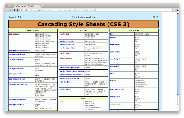
Cheat Sheet for CSS3
During the table with the tips are very helpful to quickly recall the syntax of the desired properties. Smashing Magazine has prepared a cheat sheet for CSS3, which can be downloaded and printed.


